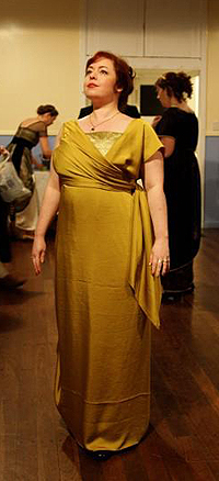
“You needn’t wear ‘greenery-yallery’ gowns, you know.” said George, laughing; “that’s the one unpardonable thing.†-From Sir George Tressady, by Mrs. Humphrey Ward. Me, in a “greenery-yallery” Edwardian gown by The Dreamstress.
There’s a color that, like a silvereye bird – or is it a waxeye? – flits in and out of style without anyone agreeing on what to call it. It meanders around the overlap between yellow and green. Citron, celery, lime, acid yellow, neon green, ochre – let us call it chartreuse. Now that winter is coming, I crave it for my winter wardrobe.
It’s tactfully described, even in acknowledgements of its fashion moment, as “one of the most difficult colors.” The other day, a friend looked at two purses sitting on my sofa, and said, “I like your bag! Um, NOT the lime green one…” Feel free to hate chartreuse, because that leaves more for me. I find it a great vivid/neon to add to a New Zealand wardrobe, a fine high note against all the black, grey, and dark tones. Like hot orange, it plays off against the colors found in nature in New Zealand. And, like hot orange as chronicled by The Dreamstress, it has a fascinating history.
Chartreuse’s last major moment was its association with the British Aesthetic movement and the intellectual-yet-seamy side of the late Victorian period (1870-1900). Both the movement and the color were famously mocked as “greenery-yallery.” The notorious Yellow Book with Aubrey Beardsley’s then-radical illustrations, the movement’s fondness for sunflowers, and the yellow-backed trashy novels of the period linked the colors yellow and greenish-yellow to raffishness and intellectual pretension. The blog Babylon Baroque has a great entry about this alone, including this immortal snippet from Gilbert and Sullivan:
“A pallid and thin young man
A haggard and lank young man
A greenery-yallery, Grosvenor Gallery, Foot-in-the-grave young man!”
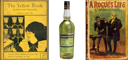
Giving chartreuse its bad name: The Yellow Book, illustrated by Aubrey Beardsley, a bottle of Charteuse liqueur, and a scandalous “yellow-backed novel.”
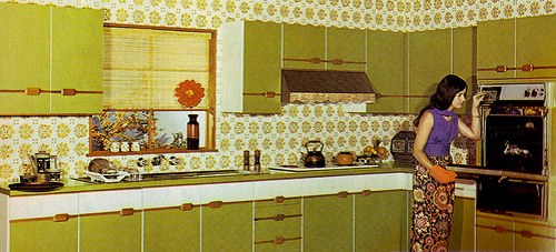
Chartreuse returned nearly a hundred years later, as a a fine avocado line running through the 60s and 70s, especially in the home – in the 1970s yellow-green was seen as uniting nature and futurism. And, just as “greenery-yallery” was soon mocked in the 1890s, avocado, like macrame, soon became a byword for the era’s aesethetic extremes.
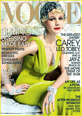
Cover of Vogue, May 2013. Not only is this the most difficult shade of chartreuse to wear, but the dress itself was forwarded to me as a “you’ll like this” image several months earlier.
Vivid greens were part of the fad for neon in the 1980s, but the color was dropped like uranium in the 90s. Yellow tiptoed back into fashion in the late 2000s, often paired with gray, and chartreuse followed soon after. Primary, Big Bird yellow remains hot, but it’s difficult to wear – even for these models. And, difficult as chartreuse is, it is more forgiving than that crayon-box yellow.
The past two summers in the Northern hemisphere were as chartreuse as an Aesthetic salon in 1893. Especially in Philadelphia, I saw it adding punch to black and white ensembles. Here in New Zealand, I like to style it just like Sirocco the kakapo does; with darks and neutrals, and a well-defined beak – I mean, mouth. For a cheerful and different pin-up or Scandinavian take, chartreuse plays beautifully with red and orange, too.
As much as I love chartreuse, I’ll put it down if I’m tired or having a complexion-challenged day. I wouldn’t have to do that if I had a delicious caramel or coffee complexion.
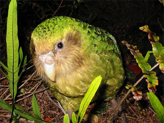
Style chartreuse as Sirocco the kakapo parrot does: with neutrals and with either a defined lip or eye. Sirocco goes for the eye.
Here are some of the ways I wear chartreuse:
- Chartreuse top and gray jeans or trousers.
- Chartreuse scarf- mine is soft and translucent, reducing the color intensity slightly.
- Enameled chartreuse pendant to liven up black and cobalt.
- Chartreuse eyeshadow as a dash of color with my hazel eyes.
- Chartreuse paired with tomato red for a special occasion!
